Architect’s Studio in East Austin

Photography by Leonid Furmansky
Construction photos by Tim Derrington
TLDR
Our Architect's Studio in Austin's Montopolis neighborhood is an intentionally practical, thoughtfully designed space that transitions effortlessly from a professional workspace to a future residence. By rejecting conventional cavity-wall construction in favor of exposed framing, externally applied insulation, and raw materials, we've created a transparent, functional, and honest building deeply rooted in purpose and place—illustrating our core philosophy of achieving profound simplicity by embracing constraints and reducing friction.
Tucked into the forgotten streets of Austin's Montopolis neighborhood, our Architect's Studio quietly introduces itself—not through flashiness or grand gestures, but through an understated elegance born from thoughtful practicality. This is architecture conceived from necessity, yet elevated by a relentless curiosity about materials, construction methods, and authenticity in design.

Morning light as it begins to stretch across the porch.
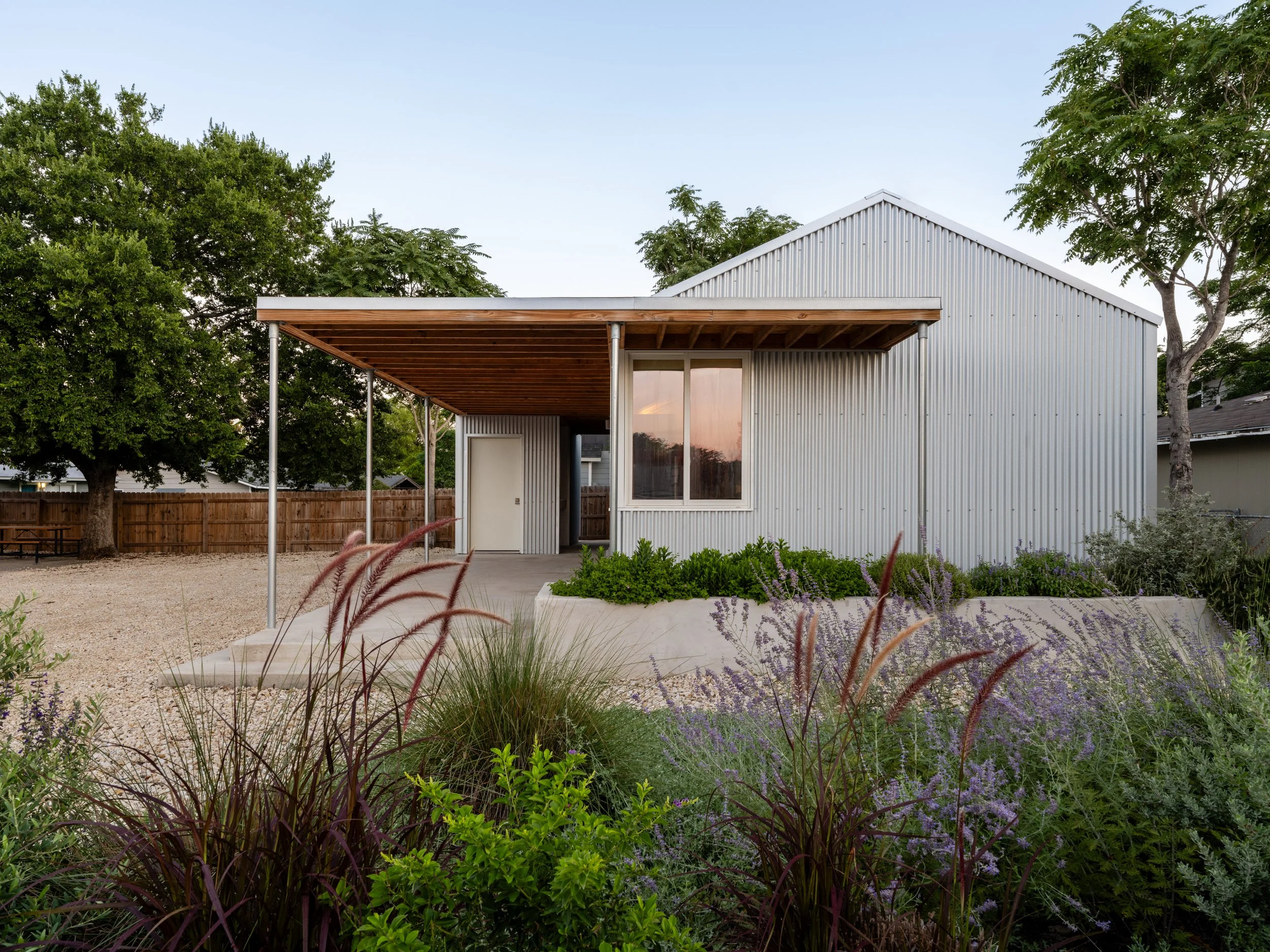
When we began the journey to create our new home base, practicality was paramount. We had clear-eyed constraints from day one: affordability, simplicity of construction, and the foresight to design a space that could easily transition from an architectural studio today into a comfortable residence tomorrow. We sought a corner lot specifically, ensuring easy access for both vehicles and pedestrians, and enabling future flexibility in land use. The modest 1,000-square-foot footprint resulted in about 650 square feet of conditioned space, supplemented by a deep porch, a compact outdoor storage unit, and intentional exterior amenities like a covered outdoor sink and an integrated raised flower bed.
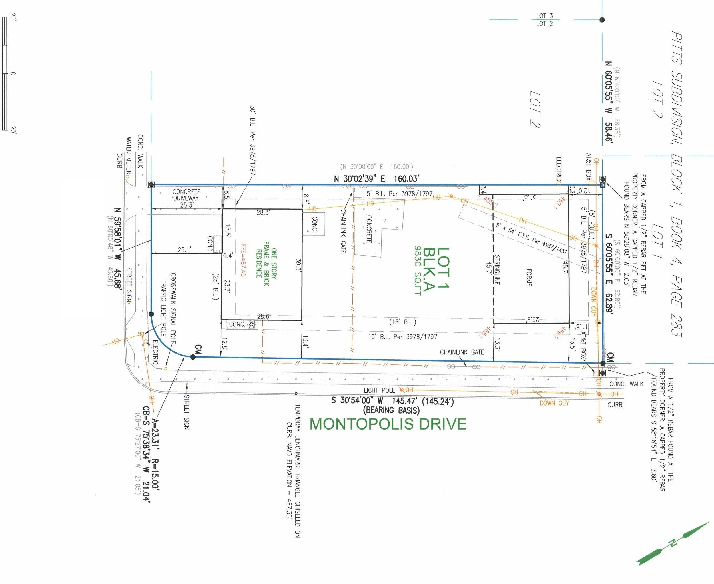
Lot survey with studio concrete formwork located. This is a city requirement to ensure the slab is compliant with any setbacks or easements.
With these practicalities established, we folded innovation, craft, and curiosity into the effort.

One of dozens of rendered plan options courtesy of Michael Rahmatoulin.
Central to our ethos is a belief that constraints should not be disguised or lamented, but rather welcomed and celebrated as integral elements of the design. The Architect's Studio exemplifies this approach by openly embracing the constraints imposed by a modest budget and in-house construction capabilities. We deliberately eschewed complicated, costly detailing that would necessitate external specialists. Every feature—from framing to finish—was intentionally selected and overseen by our team itself.

Osa checks on Natalia under the midday light in the studio’s workroom. Natalia pretends to type for the photo.
A pivotal decision shaping the project was the deliberate departure from conventional cavity-wall construction. Typically hidden behind drywall, cavity walls harbor hidden threats: moisture intrusion, mold, mildew, pests, and plumbing or electrical problems that can silently erode the health of the building and its occupants. In consciously eliminating these cavity walls, we not only mitigated these health and maintenance risks but also created a transparent, honest aesthetic rooted deeply in purpose.

During demolition after the Hurricane Harvey flood in Houston, we uncovered years’ worth of roach droppings hidden inside the wall between Tim’s mom’s kitchen and pantry. No rot—just decades of unsettling buildup quietly accumulating out of sight.
By removing the cavity walls, we reimagined every fundamental component of conventional stick-frame construction, transforming the typically hidden infrastructure into central elements of the studio's architectural expression. Each piece of lumber, plywood, screw, and nail was carefully considered, positioned, and composed. Wires, pipes, and conduits that usually lurk unseen behind drywall became intentional, artfully integrated visual elements—part of the overall design rather than practical necessities hastily concealed.
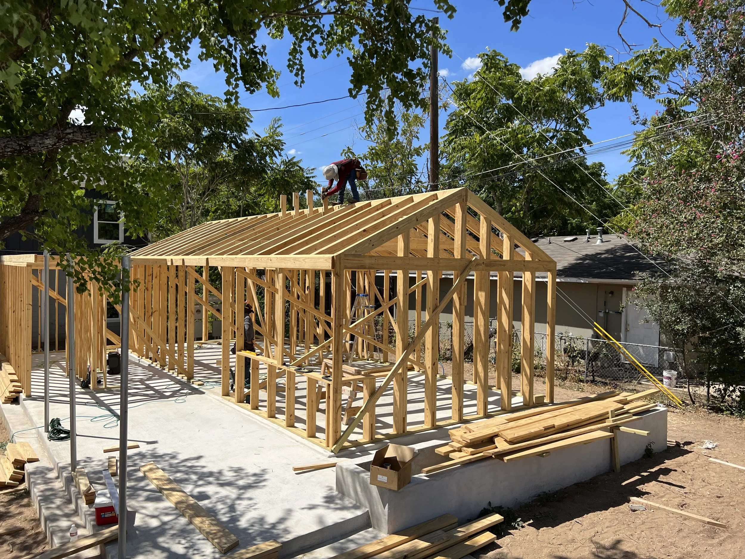
Tony, with cat-like balance, installs the short wall of the skylight volume.
In this transparency, inspiration was drawn from architectural traditions that have long celebrated exposed structure and materials. We looked to Japanese, Scandinavian, and Alpine architectural heritages, cultures that have historically mastered the art of exposed timber framing, turning structure into exquisite interior expressions. The old timber traditions of those cultures were reinterpreted through a lens of American industrial practicality, highlighting the beauty inherent in raw, responsibly applied materials. Through careful synthesis, these influences gave rise to a calm, intentional, and expressive interior aesthetic, highlighting the beauty inherent in raw, responsibly applied materials.

Midday light streaks down the wall just before solar noon during the summer solstice. In the winter, the light barely reaches the top shelf.
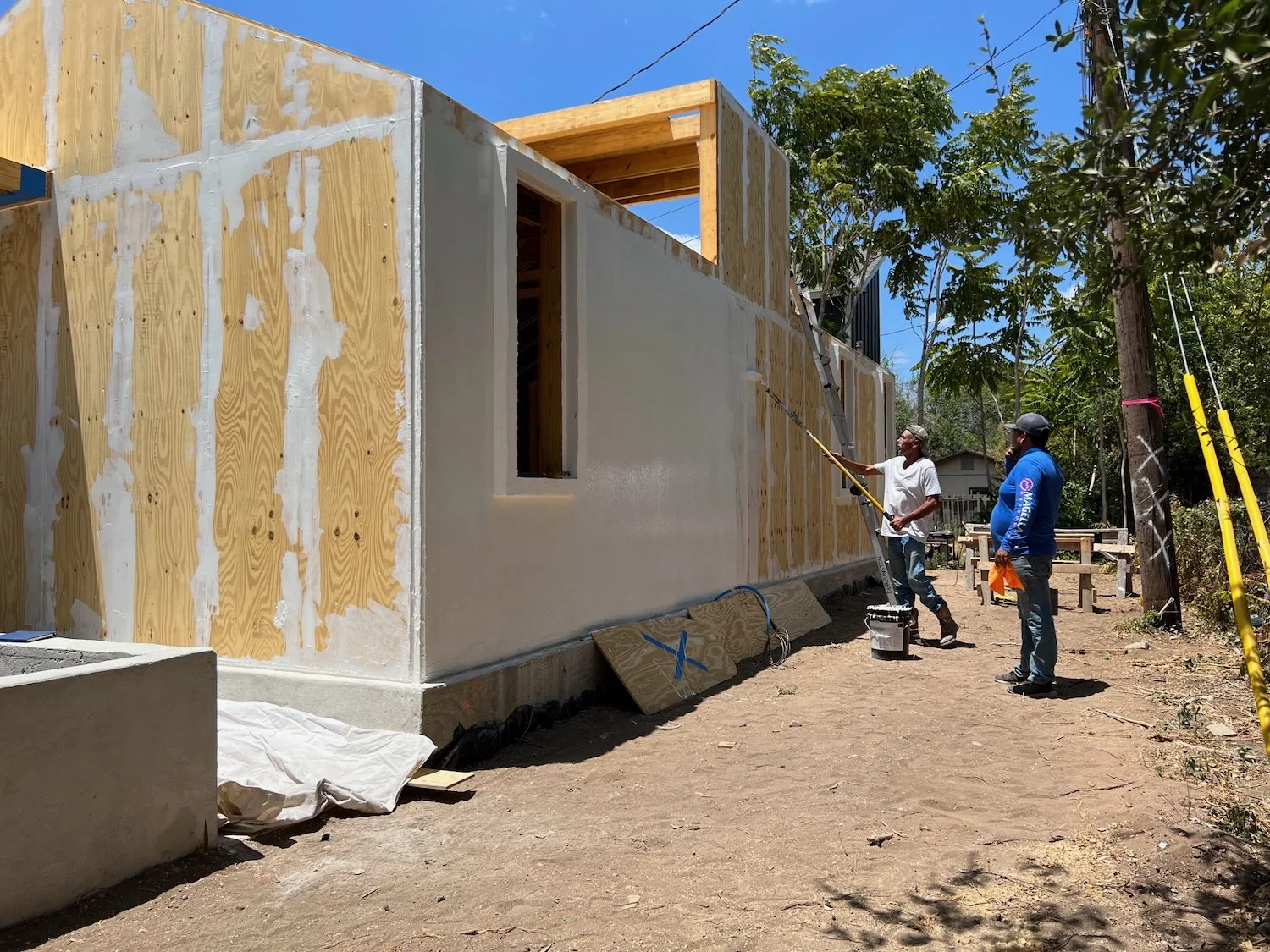
Crucially, to achieve this visual and structural honesty, we turned conventional insulation methods inside out, applying polyisocyanurate (polyiso) insulation externally rather than within wall cavities. This decision not only safeguarded the studio's transparency but enhanced the building’s thermal performance, an essential consideration beneath the intensity of the Texas sun. Every detail, from the smallest fastener to larger infrastructural considerations, was treated as an integral part of the whole, carefully curated and crafted.
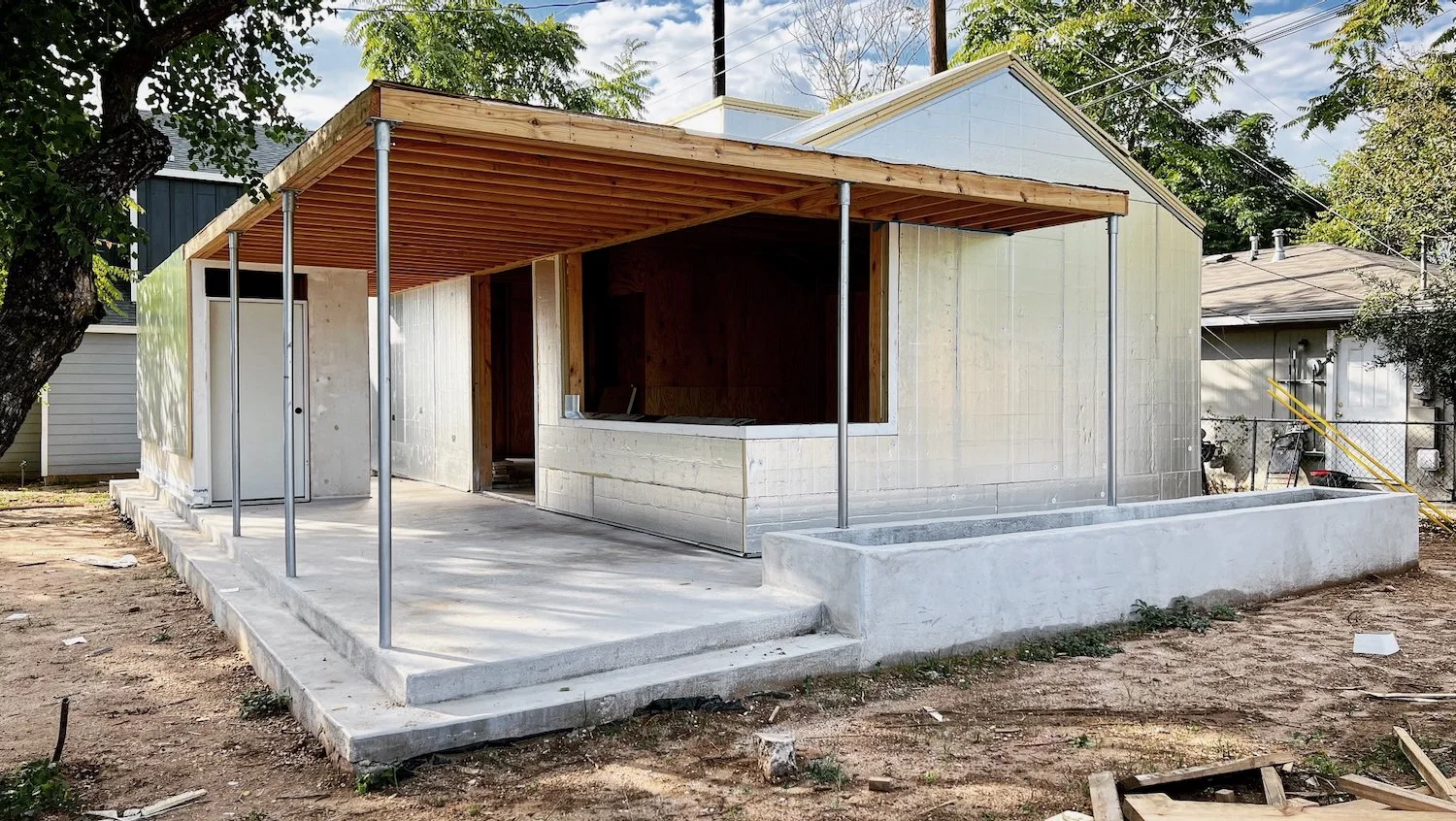
Layered polyiso insulation installed over the plywood sheathing (fluid-applied weather barrier was “painted” over the sheathing before the insulation was installed).
Even the exterior material choice—Galvalume siding—carried multiple layers of meaning and purpose. Its practicality was indisputable, offering decades of low-maintenance durability and reflecting solar heat to enhance interior comfort. Yet beyond its functional merits, Galvalume carried deeper significance, resonating with the cultural imagery of rural Texas. Its subtle nostalgia blends effortlessly with the Montopolis neighborhood’s character, reinforcing the building's quiet integration into its historical and cultural context.
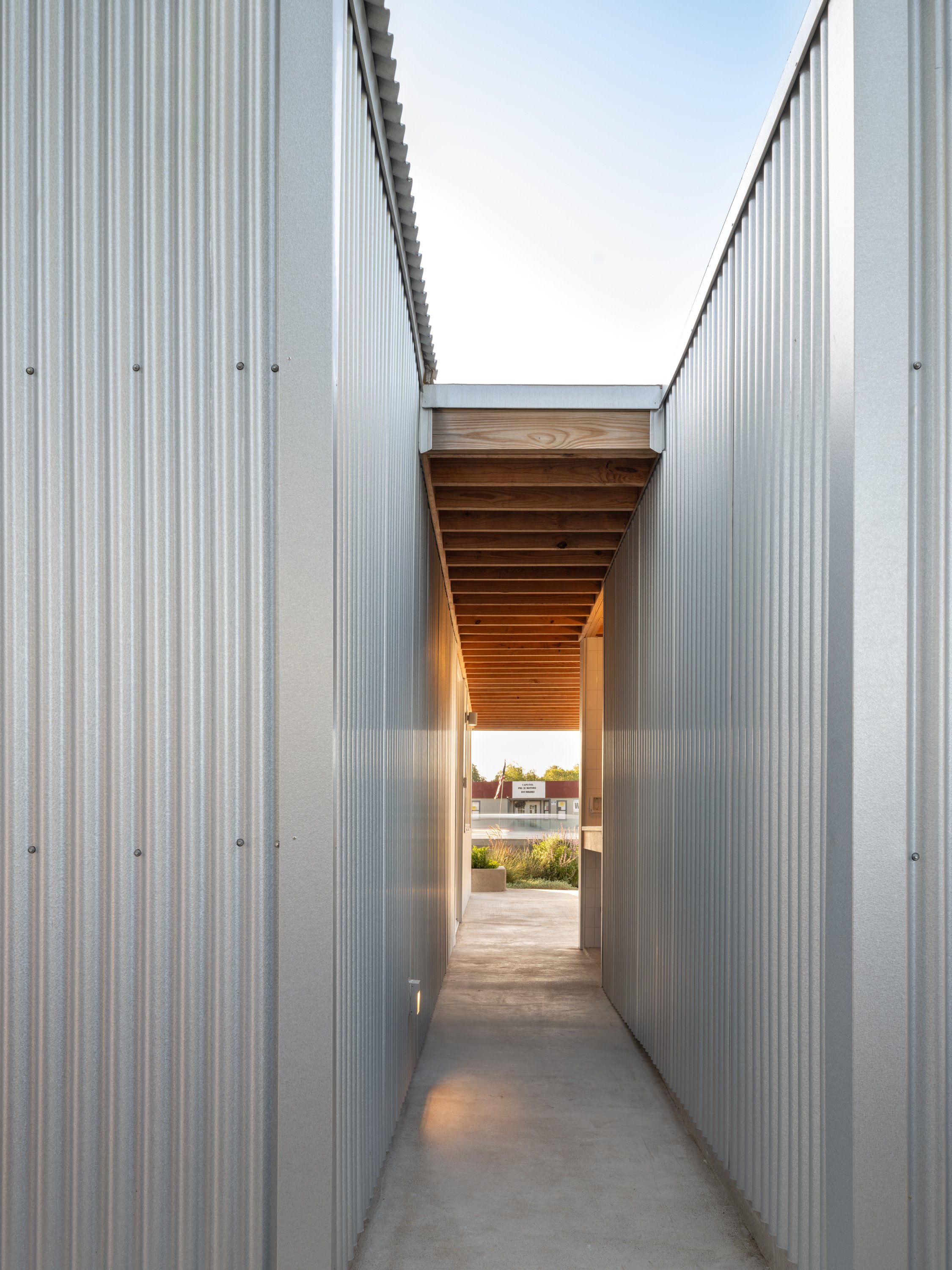
The warm wood stands in bold contrast to the cool, crisp siding—a pairing that’s both striking and intentional. Fun fact: the siding produces a faint, tinny reverberation that sounds subtly robotic, lending the space an unexpected, otherworldly tone.
This harmony with context extends to the studio's overall form, designed to complement the residential scale and style of a neighborhood built primarily between the 1950s and 1970s. Rather than imposing a new or alien language, our studio gently acknowledges its surroundings, its carefully considered proportions and modest scale fitting into the fabric of the community. In fact, several community members helped us with the construction.
View from the sidewalk with native plantings.
Our neighbor, Roy, rolling the weather barrier as Rafa “supervises”.
Inside, the studio accommodates the demands of a professional workspace. Two main rooms serve the functions of a main workspace and a meeting room, with additional considerations such as a full bathroom, a kitchenette featuring tall cabinetry for ample storage—including space for an all-in-one washer-dryer—and carefully crafted built-ins. These interior spaces, defined by their exposed wooden structure and raw finishes, convey a sense of openness and honesty that aligns perfectly with our commitment to transparency in both architecture and practice.

Tim and Michael pretending to be architects for the photo while deadpanning dad jokes. But that light though! Only the nightlight in the bottom corner was accidentally left on.
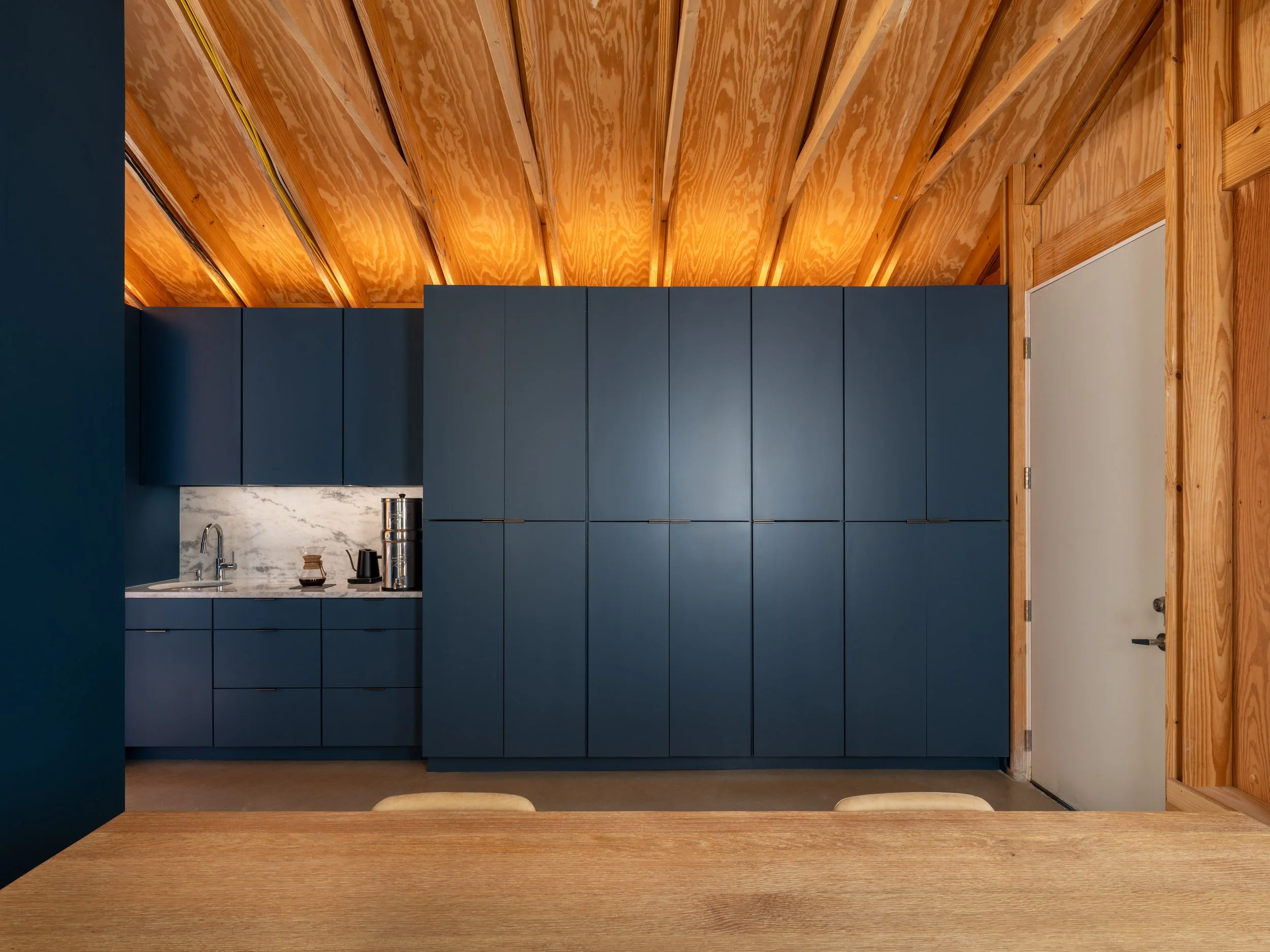
Kitchenette and additional storage as seen from the meeting room table.
Outdoor spaces, too, speak directly to the project's underlying values. The deep porch and additional covered areas offer practical workspace expansions and informal meeting spots, while simultaneously enhancing the studio's connection to the garden and neighborhood beyond.
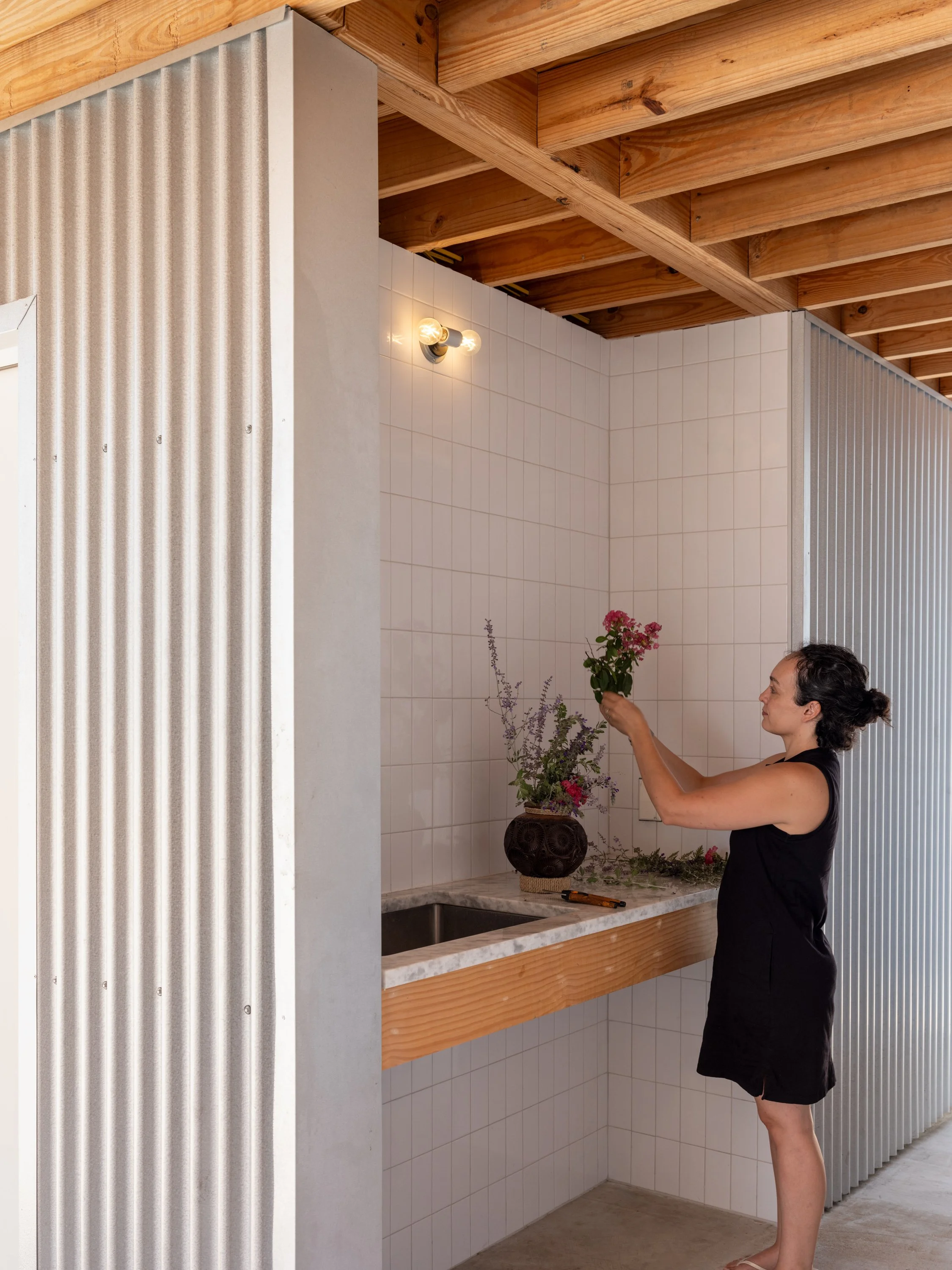
Natalia arranging flowers picked from the garden. She uses the outdoor sink often after gardening.

Morning sun + garden + corrugated galvalume.
Ultimately, the Architect's Studio embodies our core philosophy, succinctly expressed as “a path of less resistance.” This is not a call to minimal effort but rather an acknowledgment that things inherently fail when forced. Instead, our design practice revolves around reducing friction, finding harmony between constraints and creative potential, and crafting architecture where every choice—visible or hidden—is intentionally, meaningfully made.

Michael poses as a focused architect while the moody blue and the warm wood tell you everything you need to know.
For young architects and design enthusiasts alike, the Architect's Studio serves as an aspirational model of thoughtful simplicity and integrity. It shows that architecture need not be grandiose or expensive to be impactful. True innovation and beauty can emerge naturally from constant curiosity, a clear-eyed engagement with practical realities, and a commitment to authenticity.
In Montopolis, quietly situated on its corner lot, our Architect's Studio makes an optimistic statement—not through complexity or excess, but through simplicity, clarity, and a commitment to doing more with less. Dieter Rams said it best, “Less, but better.”

Street presence or curb appeal? Either way, this is the appearance to pedestrians and passengers. It’s important to note that we designed the 4’ tall concrete wall so that it would not hide our studio from passersby.